
Forging relationships with a target audience and having a business grow considerably are typically hand-in-hand for many businesses. A great way for this to happen is by harnessing the power of technology through the internet. You can start by hosting webinars on social media and/or your website.
Webinars
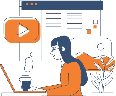
Engaging with possible customers and having your lead lists grow exponentially can be done through webinars. Creating and marketing a webinar takes quite some time. In order to strike a considerable chord within communities, it needs to be done properly. However, even with the obstacles or difficulties some may face with webinars, more and more businesses will likely use them. According to research, 84% of online purchases were because of a branded video.
Take your website traffic into account alongside the nearly 4 billion people who use social media (Facebook, Twitter, etc). When that’s done, it will be crystal clear as to why this marketing strategy is golden.
There are more benefits to webinars, such as:
- Boosting engagement on all platforms
- Increased brand awareness
- More convenient ways for new prospects to be funnelled in
- Stronger social presence
Create an Effective Webinar Landing Page
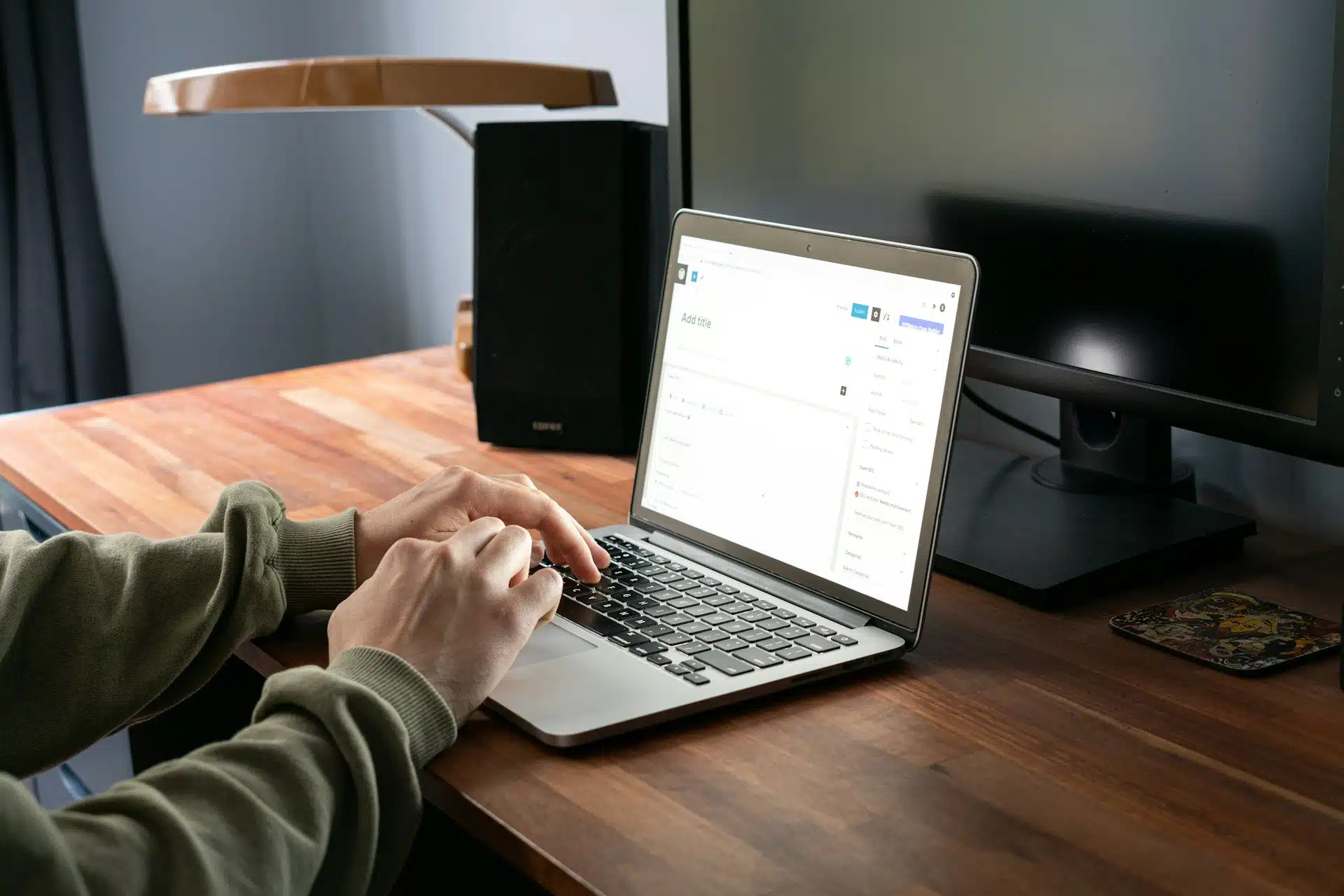
Calgary web design plays a key role in the effectiveness of a landing page for webinars. This is crucial because attracting attendees involves having to get advanced sign-ups. Tips on getting this done include:
Specify Your Topic
Before anything else, it’s important to have a clear focus as to the presentation’s topic. After all, the only way people will want to attend is if they’re interested. If the web design does its job with a stellar landing page but the topic is dull, the results will not be ideal.
If you’re not sure what there is to talk about, then talk to your customers. Have a feedback form on your website. Send surveys to social media followers and email subscribers. When there are several topic ideas at hand, it gets somewhat simpler. Just ask if they would be interested in attending. Customers are the best source of feedback, including webinar ideas.
Keep Things Simple
Reports show that 28% of people will click away from a website if the registration form is complicated or long-winded. The same applies to a landing page that takes far too long to load. That means a number of people who won’t ever see your event’s purpose in the first place.
Forms that are short but substantial should do the trick. Try going with three questions: name, e-mail address, and a totally optional third question like what their goals are. That way, you can hopefully get a feel of the overall audience.
FOMO Marketing
Fear of missing out, or FOMO, can be a rather powerful marketing strategy. Availability and time limits can lead consumers to make a split-second purchase. 7 out of 10 Millennials experience FOMO, and research suggests that 60% of shoppers bought something because of it.
Conclusion
Optimizing a webinar landing page is vital to its success. Web design plays a key role in its looks and functionality, including the short loading times. Making sure the landing page is effective includes FOMO marketing, keeping things simple, and specifying the topic.
Need to work with Calgary web design experts to improve your webinar landing page? Contact Hello Digital Marketing today! We love creating digital solutions for all types of businesses in Calgary and Winnipeg.
Recent Articles
Write For Us
Think you’ve got a fresh perspective that will challenge our readers to become better marketers? We’re always looking for authors who can deliver quality articles and blog posts. Hundreds of your peers will read your work, and you will level up in the process.Ready to grow? Say Hello


