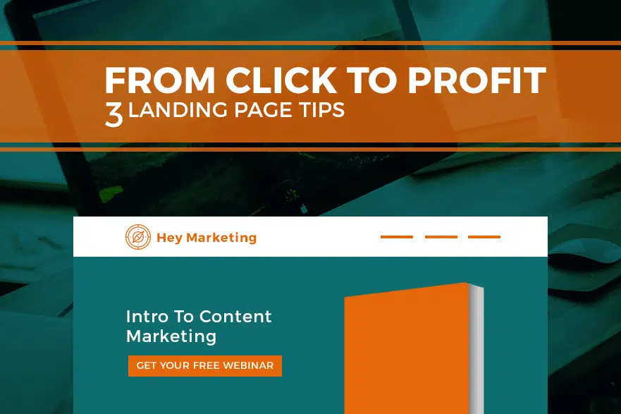

You have an offer, and you want people to click that offer. Maybe it’s a free coupon, or an e-book. Whatever it is, it’ll probably wind up on a landing page.
A landing page is just that: a page where people “land”—or, where they end up after clicking a link. That landing page is going to make or break people’s interest in your offer.
Hang on—before you create your landing page…
a) Make sure your content offer is solid. Sure, it’s great to put something together, but unless you’re sure it’s what your audience needs, it probably won’t contribute much to your bottom line. Also, your content offer should be appropriate for the buyer’s journey stage your leads are at.
b) Make sure that the link pointing to the landing page sets the right expectations. If you set up a social media post that says, “Download your free e-book here!” and someone clicks and lands on your website’s home page, they’ll probably leave because the offer won’t be front and centre.
c) Prepare an appropriate thank-you page to follow your landing page. Funnel your leads back onto the website, toward social media, or anywhere else they’ll spend more time after downloading your offer.
Here are the top 3 things your landing page needs to survive on the cold, cold web:
 #1 – Think Of It Like A Trade
So you want someone’s information, and they want your offer. The trick is to strike a balance between the potential lead’s idea of your offer’s value, and your own. If you ask for a lot of information, the offer must suggest high value for your potential lead. If not, the lead won’t want to trade his or her information for the offer.
What Should I Do?
Only ask for the information that you need. A name, email address, and a website address, job title, or something more telling should be it—3 to 5 fields, max.
SEE ALSO: 3 Tricks To Setting Website Goals That Work
 #2 – Remove All Distractions
The Internet has created a world of people with goldfish-level attention spans. That means it’s important to aim your potential lead’s focus on the offer. The fewer other places there are to click, the greater the chances that your offer will be downloaded. Oh, and keep your text short, simple, and persuasive.
What Should I Do?
Remove all other links, including the main navigation, and other menu options. It might not be terrible to include a “Contact Us” button at the bottom of the page, but otherwise, keep it as simple as possible.
 #3 – Use A Strong Call-To-Action
It’s easy to want a simple call-to-action, or CTA, for your offer. Something like “Download Now” or “Submit” are simple go-to words, but ultimately, they’re not enticing or descriptive enough. The CTA is the final click before a potential lead becomes a qualified lead, so you want your button to really sell it for them.
What Should I Do?
Create a CTA that describes what happens next. Something like “Download Your Free E-book!” is much more powerful, even if it’s a bit long. Always start with a verb (action word), and it doesn’t hurt to add in terms like “free” to help communicate value.
Source: Hello BLOG
Recent Articles
Write For Us
Think you’ve got a fresh perspective that will challenge our readers to become better marketers? We’re always looking for authors who can deliver quality articles and blog posts. Hundreds of your peers will read your work, and you will level up in the process.Ready to grow? Say Hello


 #1 – Think Of It Like A Trade
 #2 – Remove All Distractions
 #3 – Use A Strong Call-To-Action


